Editing Components on Templates
The following table describes the different components you can add to a template and the controls they show when they are placed on the template.
|
Component |
Description |
Controls in the Visual Logging area |
|
|
Free text: Used to enter text. |
|
|
|
Buttons: Used to create a set of buttons, of which none, one, or more than one can be selected at the same time. |
|
|
|
Dropdown: Used to create a drop-down list from which one or more than one item can be selected. |
|
|
|
Number: Used to enter a number, for example, the distance from the goal. |
|
|
|
Rating: Used to select one through five stars. |
|
|
|
Score: Used to enter the score of a game. |
|
The following table describes the buttons you can use to edit the components on the template.
|
Button |
Used by Component |
Function |
|
|
Buttons Dropdown |
Switches the editor from preview to edit mode and lets you add items, change item labels, and delete items from the button or drop-down component. |
|
|
All |
Removes the component from the Template. When you remove a component from a session template the corresponding column is removed from the Text Logging area. You cannot delete a component that is in use by a span from a session template. |
Editing Common Component Settings
Component name and label are settings that are common to all components you add to a template. You change them for all components in the same way, as described in the following procedure. For Number, Rating, and Score components, name and label are the only settings you can change.
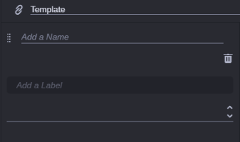
To edit common component settings:
-
(Optional) Change the component name. This will change the header of the corresponding column in the Text Logging area.
-
(Optional) Click in the Add a Label field and type a label. You can type 100 characters at maximum.
The label provides additional information on the component.
Editing Button Component Settings
After you added a button component to a template, you see the component with an instruction in the editor field, as shown in the following illustration.
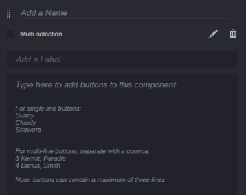
Additionally to the common settings name and label, you can change the following button component-specific settings. For information on how to change the common settings, see Editing Common Component Settings.
To edit specific button component settings:
-
Click in the “Type here to add buttons” field.
-
Do one of the following:
-
For single-line buttons, type each item on a separate line, then press the Enter or Return key. For example, entries in a list of weather conditions are listed as follows:
Sunny
Cloudy
Partly Cloudy
Showers -
For multi-line buttons, type the information for each button on a single line, separated by commas, then press the Enter or Return key. Each comma forces a line break on the button. Each button can display a maximum of three lines. Example for a three line button:
3,		  Kermit, Paradis
4,		  Darius, Smith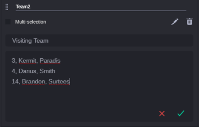
-
-
Do one of the following:
-
To discard your changes, click the red X.
-
To save your changes, click the green check mark.
The editor closes and the buttons are shown in preview mode on the template. The button height is based on the number of text lines.
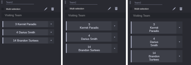
The button width is determined by the width of the component on the template. Three buttons can be shown in one row at maximum.
To toggle the editor from preview back to edit mode, click the Edit button in the component header.
-
-
Select the Multi-selection check box if you want to allow populating a span with multiple button values.
Editing Dropdown Component Settings
After you added a dropdown component to a template, you see the component with an instruction in the editor field, as shown in the following illustration.
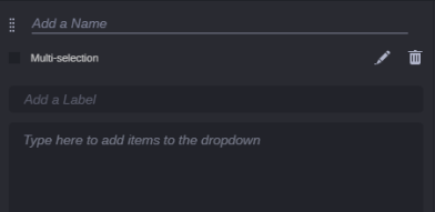
Additionally to the common settings name and label, you can change the following dropdown component-specific settings. For information on how to change the common settings, see Editing Common Component Settings.
To edit specific dropdown component settings:
-
Click in the “To add items to the dropdown type here” field and type each item on a separate line, then press the Enter or Return key.
For example, entries in a list of weather conditions are listed as follows:
Sunny
Cloudy
Partly Cloudy
Showers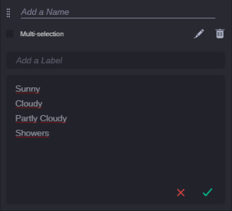
-
Do one of the following:
-
To discard your changes, click the red X.
-
To save your changes, click the green check mark.
The editor closes and the dropdown is shown in preview mode on the template.
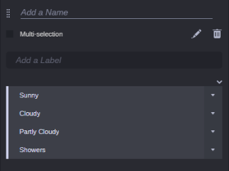
To toggle the editor from preview back to edit mode, click the Edit button in the component header.
-
-
Select the Multi-selection check box if you want to allow populating a span with multiple values from the drop-down component.
Deleting Components from a Template
You can delete a component from a master template at any time. Note that you cannot delete a component that is in use by a span on a session template. For those components, a warning message is shown after you click the Delete button and the component is not deleted.
To delete a component from a template:
-
Click the Delete button of the component in the Visual Logging area.
A security prompt opens.
-
Click Delete.
The component is removed from the template. The remaining components are moved and resized to fill the space.


