Understanding the Layout of the Results Area
The Results area displays the assets of the selected folder. As illustrated below, the Results area toolbar includes information about the number of assets contained in the folder as well as a set of options that can be used to modify the area’s view.

The following sections describes the features available in the Results area.
n When you dock the Browse app, the standard size of the docked app displays only the Refresh button, Results count, and view options in the Results area.
Refresh
The Refresh button allows you to update the contents of the current directory without navigating away from your current location. If multiple users are working in the same directory, you can click the Refresh button to see the latest content.
Results Count
The Results count in the upper-left corner of the area indicates how many assets are contained in the selected folder. If the folder is empty, the count reports zero assets.
View Options
The Results area is displayed in List view by default. However, you can change the look of the area by clicking the Card button. Depending on the selected view, assets are listed with varying levels of detail related to the associated metadata.
|
Button |
Name |
Description |
|
|
Card |
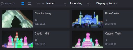
Displays each item of the folder as an asset card. For each asset, the following are shown:
When you hover the mouse over an asset card, three dots are shown at the bottom right corner of the asset card; when you hover the mouse over the dots, a pop-up window shows additional metadata. When you hover the mouse over the header frame, you can use the Hoverscrub feature. See Using the Hoverscrub Feature. For each folder, the following are shown:
|
|
|
List |
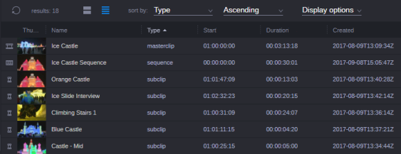
Displays the folder contents as a list. For each asset, the following are shown:
The following columns are shown by default: Asset type icon (no label), Thumbnail, Name, Creator, Created, Modifier, and Modified. You can show and hide additional columns. You can adjust the width of columns and rearrange the order of columns by dragging and dropping. |
The following illustration shows you the Results area in Card view.

The following illustration shows you the Results area in List view.

If the header frame does not provide a good representative image of the asset, you can update the image with an alternate frame of the same asset. For more information, see Updating the Asset Thumbnail.
Changing the Order and Size of Columns
When in List view, you can reorder the columns by simply dragging and dropping the column to a new position. Additionally, you can use your mouse to click on the divider between two columns to adjust a column to a custom size.
To rearrange the column order:
-
Click and drag a column head to the left or right column.
A blue line shown to the left of the column indicates the drop target.

To adjust the column width:
-
Click the column divider and drag it to the left or right.

Sort By Menu
The Sort By menu lets you select the property that is used for sorting the contents of the Results area. The Sort By menu is available in both the Grid and List view. In List view, you can also click on a column header to sort the contents. The Name property is selected by default. The selection of the sort by property persists from one session to another.
When you click the “sort by” field, the system displays a menu of single-value properties that can be used for sorting. The menu is populated with a list of common sorting options followed by additional properties grouped by module type. You can review the list of properties using the scroll bar on the right-side of the menu. If you are looking for a specific property, you can search for the name of the property by entering it in the text bar at the top of the menu.
To sort using the Sort By menu:
-
Click the Sort By drop-down menu.
A list of properties appears. The property that is currently used for sorting is highlighted with a blue bar.
-
(optional) Do one of the following:
-
Start typing in the filter text box. The menu filters the list to all properties containing the letters you type.
-
Scroll down the list and expand the property groups to show additional properties.
-
-
Click the property you want to use for sorting.
The Sort By menu closes and the contents of the Results area is sorted by the selected property.
Sort Order Menu
The Sort Order menu lets you define the sort order: ascending or descending. Ascending is the default sort order. It sorts results sequentially, beginning with the lowest number and the first letter alphabetically. The only exception are dates, for which Descending is the default sort order. It sorts results sequentially, beginning with the newest date.
The last selected sort order persists from one session to another.
To change the sort order:
-
Select Ascending or Descending from the Sort Order menu.
-
(List view only) Click the heading of the column by which you want to sort.
On first click, the column is sorted in ascending order. If you click the column again, it changes to descending order. A third click of the column resets to the original sort order (before you clicked the column header).
Display Options Menu
The Display options menu shows you all single-value properties from the connected modules that you can use in the Results area. The menu lets you define the following:
-
The columns that are shown in List view.
-
The properties that are shown in the pop-up info for each asset in Card view.
The following are shown by default: Icon, Thumbnail, Name, Creator, Created, Modifier, and Modified. The Icon and Name values are mandatory and cannot be hidden. Changes you apply to the Attributes menu persist from one session to another.
You can change the display format of date-time attributes, such as Created or Modified, in the User Settings. See User Settings.
When you click the Display options field, the system displays a menu of single-value properties that can be used with the Browse app. The menu is populated with a list of common sorting options followed by additional properties grouped by module type. You can review the list of properties using the scroll bar on the right-side of the menu. If you are looking for a specific property, you can search for the name of the property by entering it in the text bar at the top of the menu.
n The Production Management > Current Video Resolution option displays the resolution for the given asset. As sequences might contain multiple assets at different resolutions, MediaCentral Cloud UX displays the video resolution data from the first video asset in the sequence. Note that this data might not be available on all sequences due to source and other complexities.
To select properties:
-
Click the Display options drop-down menu.
A list of properties appears. The properties that are currently used are highlighted with a blue check mark.
-
(optional) Do one of the following:
-
Start typing in the filter text box. The menu filters the list to all properties containing the letters you type.
-
Scroll down the list and expand the property groups to show more properties.
-
-
Click the check boxes to select additional properties and add columns to the Results area. Alternatively, you can deselect properties to remove them from the area.
-
Do one of the following:
-
Press Enter or click an area outside of the menu to apply your changes.
-
Press Esc to revert your changes.
-

