Working with Topics
Topics and assignments are similar concepts in that you can assign people, resources, media assets, and metadata to both, and you can update all of these areas throughout the life cycle of the project. The primary difference is that topics are often higher level concepts that link to related assignments. For example, you might create a topic called “Feng shui Homes” where you create a team of people and resources that are associated with that concept. After you create the topic, you can create individual assignments that contribute to the completion of the overall topic.
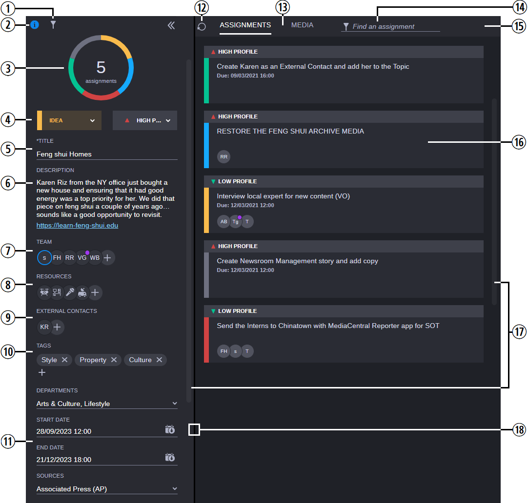
The Topic screen is divided into two main areas: the Info panel on the left, and the Assignments and Media areas on the right. The following illustration and table describe this screen.

|
|
Button or Function |
Description |
|
1 |
Filter Button |
Similar to the Filter button that is available in the Project Planner, this button displays a list of filters that you can use to narrow the displayed assignments for this topic. For more information, see Working with the Planner Filters Tab. |
|
2 |
Info Button |
Allows you to open or close the Topic Info panel. For more information, see Opening and Closing the Info Panel. |
|
3 |
Assignment Counter and Description |
The counter displays the number of assignments that are associated wit h this topic.
The area circling the counter provides you with additional graphical view of the overall status of the assignments that are linked to the current topic — white for new, blue for in-progress, and so on. If you hover your cursor over the counter, the app displays a tool-tip that provides more information about the status of each assignment. |
|
4 |
Priority and Status Menus |
These menus allow you to update the priority and status values that are associated with this topic. For more information, see Assigning the Priority and Status. |
|
5 |
Topic Title |
This Displays the name of the topic. You can click once in this area to rename the topic. |
|
6 |
Description |
The text field below the graph allows you to enter a short description of the topic or add links to external content. If you add a web link, the link becomes active after you finish editing. When you click on a hyperlink, the Collaborate app opens the page in a new tab in your browser. |
|
7 |
Team |
Displays the employees or freelance contacts that are associated with this topic. You can place your cursor over each avatar to obtain more information about the team member. If you are assigned to a topic or an assignment, your name appears first in the list of resources and your avatar is outlined in blue. If you see a purple dot above a contact’s avatar, it indicates that the user has enabled their Out of Office status n If you need to update your Out of Office status or make any changes to your user profile, you must contact a Collaborate Supervisor to make these changes for you. For more information, see Adding and Removing Team Members, Resources, and External Contacts. |
|
8 |
Resources |
Displays the resources that are associated with this topic. For more information, see Adding and Removing Team Members, Resources, and External Contacts. |
|
9 |
External Contacts |
Displays any guest or organization type contacts that are associated with this topic. You can place your cursor over each avatar to obtain more information about the contact. For more information, see Adding and Removing Team Members, Resources, and External Contacts. |
|
10 |
Tags |
Displays any tags that might be associated with the topic. For more information, see Adding and Removing Tags. |
|
11 |
Metadata |
This area provides you with important information about the topic. For more information, see Working with Metadata. |
|
12 |
Refresh Button |
If you have multiple users contributing to the same topic, you can click this button to refresh the app so that you can see the latest updates from all users. |
|
13 |
Assignments / Media toggle |
Defaulting to the Assignments view, these buttons allow you to switch between the Assignments and Media tabs. For more information on the Media tab, see Working Within the Media Container. |
|
14 |
Assignment / Asset Filter |
The “Find an Assignment” or “Find an Asset” field allows you to search within your topic for specific assignments or media assets. If you are working in the Media container, the search also looks for a text match within any notes that you might have created. Partial word searches are not supported. If for example your asset includes the word "Interview", a search for "Interview" would return the asset, but searches for "inter" or "view" would not. |
|
|
Filter and Sort options (not shown) |
Similar to other areas of MediaCentral Cloud UX, the filter and sort tools allow you to organize your assets by familiar categories such as Date Added, Name, and others. You can further refine your display by selecting an option from the Ascending / Descending menu. |
|
16 |
Topic Details |
If you select the Assignments tab, the app displays the assignments that are associated with this topic and includes information on their status, priority, title, and due date. If you select the Media tab, the app displays any media assets that you might have added to the container. |
|
17 |
Scroll Bars |
If your browser window does not provide enough space to display the entire topic, you can use these bars to scroll through the topic and assignments list. |
|
18 |
Panel Divider |
You can resize the amount of space allocated to the Info panel by dragging the divider to the left or right. If you adjust the size of the panel, this change remains consistent across different MediaCentral Cloud UX sessions. The size of the panel is saved in your local browser cache, so the change remains consistent across different MediaCentral Cloud UX sessions (on a per user / per workstation basis). |
Opening and Closing the Info Panel
When you create a new topic, the Topic Info panel is displayed automatically. When you revisit a topic, this area is hidden by default. You can click the Info button to display or hide the Topic Info panel. As long as you do not close the Collaborate app, this setting persists throughout your MediaCentral Cloud UX session.
![]() Once open, you can click the Collapse button to hide the Info area. The Collapse button is located in the upper-right corner of the Info panel.
Once open, you can click the Collapse button to hide the Info area. The Collapse button is located in the upper-right corner of the Info panel.
Working with Date Fields
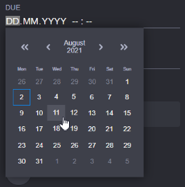
When you select a field that requires you to enter a date, the Collaborate app displays a calendar that you can use to enter your required values. As shown in the following illustration the calendar includes controls that allow you to quickly jump to specific days, months, or years.

The following controls are available in the date picker:
|
Icon |
Purpose |
Description |
|
|
Back or Forward (large) |
Click these buttons to go back or forward by a larger amount of time. The increments change based on your current location in the calendar. For example if you are on the initial calendar page, these buttons advance the date by one year at a time. |
|
|
Back or Forward (small) |
Click these buttons to go back or forward by a shorter amount of time. The increments change based on your current location in the calendar. For example if you are on the initial calendar page, these buttons advance the date by one month at a time. |
|
Example:
|
Current Month and Year |
Appearing between the back and forward controls, you can click this button to display to a monthly view in which you can select a specific month within the current year. If you click the center button again, you can select a specific year (10 years displayed per page). In this case the back and forward buttons increment by either 10 or 100 years at a time. |
|
Example:
|
Current Day |
The calendar displays today’s date with a blue outline (shown left in this example). After you select a day, the value is highlighted in blue (shown right in this example). |
If you attempt to manually enter a value that is higher than the maximum possible value for that field, the app automatically replaces your entry. For example if you attempt to type 17 in the month field, the app replaces your value with 12 (December) — the maximum value allowed for that field.
Understanding the Assignment Landing Zone
When you create an assignment, you must associate the assignment with a topic. If you do not specify a topic, the Collaborate app associates the assignment with the “Assignment Landing Zone” which acts like a bucket for all unlinked assignments. You can find the Assignment Landing Zone in the Planner sidebar along with all other manually created topics.
This topic differs from all others in that it does not include the Priority and Status menus, or custom fields such as People, Metadata, or others. You cannot rename this topic.
Additional Information on Topics
This section includes the following processes:
n As both topics, assignments, and tasks share similar features and menus, many of the following processes can apply to all three item types. For assignment specific processes, see Working with Assignments.
